
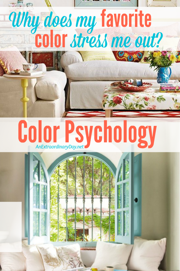
What do you know about the psychology of color?
I’ve heard that grocery stores and boutiques paint their walls so that we’ll want to buy more and restaurants choose colors that will make us hungry. Oh my! No wonder we get into so much trouble spending too much money and eating too much food.
We all have our favorite colors.
Usually if you ask me I’ll say that my favorites are yellow and red. However, in my home decor I will put together green rooms or blue rooms and my winter walking parka is a lovely shade of sage green. So I guess I’m not a single color girl.
My feel good color… the one I dream of using to redecorate my home (in my mind) is a pale yellow.
But, today the most interesting thing happened when I entered pale yellow rooms in my Pinterest search. Instead of swooning over the rooms that came up… I was put off by my favorite shade of yellow… pale butter… as well as every other shade… but especially the bold and bright yellows.
I have to tell you that totally surprised me. I wondered… why does my favorite color stress me out?
So… I went to Google and searched the psychology of yellow.
This color [yellow] relates to acquired knowledge. It is the color which resonates with the left or logic side of the brain stimulating our mental faculties and creating mental agility and perception.
Being the lightest hue of the spectrum, the color psychology of yellow is uplifting and illuminating, offering hope, happiness, cheerfulness and fun.
In the meaning of colors, yellow inspires original thought and inquisitiveness.
—Empower Yourself with Color Psychology
So why would I be repelled by beautiful pale buttery yellow?
The color yellow can be anxiety producing as it is fast moving and can cause us to feel agitated.
Yellow has a tendency to make you more mentally analytical and critical – this includes being self critical as well as critical of others.
Yellow is non-emotional, coming from the head rather than the heart. Yellow depends on itself, preferring to not get emotionally involved.
Yellow is related to the ego and our sense of self worth, to how we feel about ourselves and how we are perceived by others.
—Empower Yourself with Color Psychology
I’ve never thought of yellow as being anxiety producing or causing agitation. What I did learn is that if you’re going through a lot of change in your life… which I am… you might not tolerate yellow well. But it will pass. Evidently yellow vibrates too fast for you and makes you feel stressed. Introducing green or soft orange (really??) will help restore balance and energies.
I don’t know about you… but that was eye-opening for me.
What I did notice… was that I was drawn to pale or soft turquoises and aquas. They give off a soft soothing feel. One of my favorite places has always been the beach. I guess, I’m immediately transported in my spirit to that place of calm.
I discovered this terrific paint color chart…
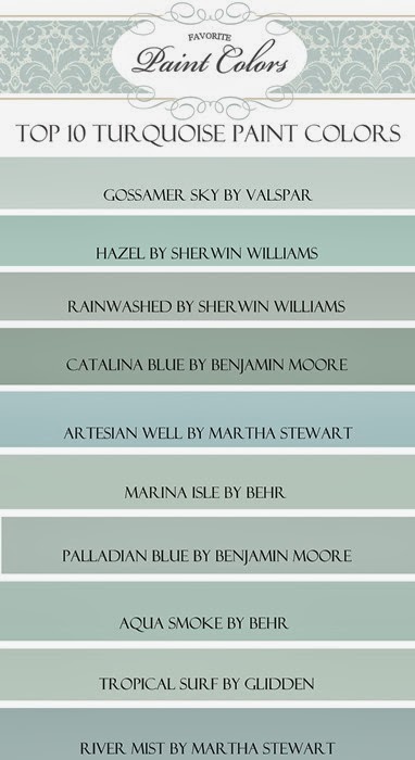
The beauty of this color family is that is can simply be paired with white and cream but will easily take the company of accent colors in deep reds and navy blues and oranges and warm yellows.
Are you drawn to any of the shades here?
Today I’m feeling the need for even more lightness and brightness.
Humor me and let’s go for a tour of my imaginary light and bright pale aqua or turquoise home.
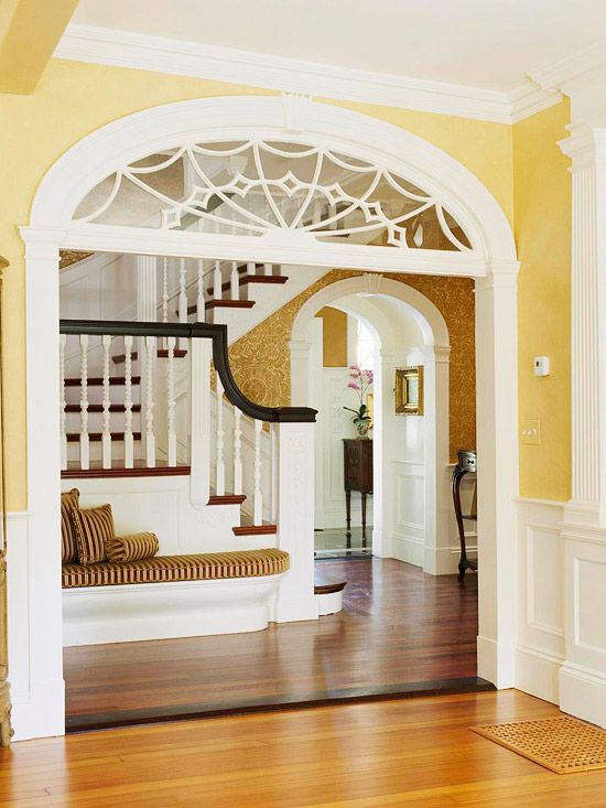
What a grand entrance! These French doors just put a smile on my face.
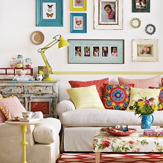
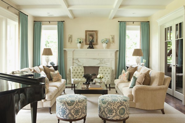
This living room is quite formal, but it’s lovely and bright with all the tall windows. The drapes make the room come alive with the serene shade of turquoise.
Such a peaceful bedroom. How wonderful it would be to enjoy a fireplace during the long cold winter months.

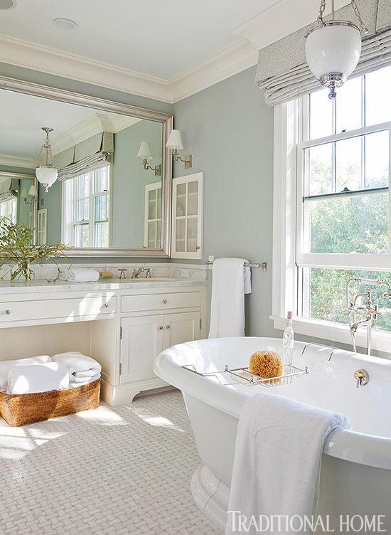
Such a relaxing and soothing bath with a glorious soaking tub.
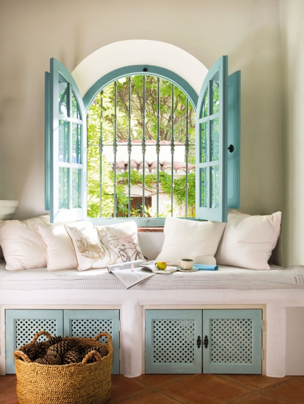
How fun to sit here and dream and read and stare out the window.
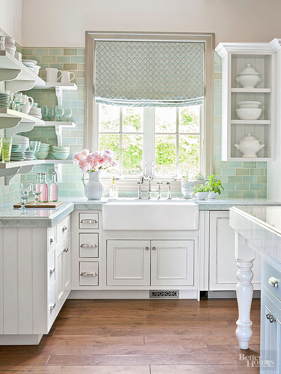
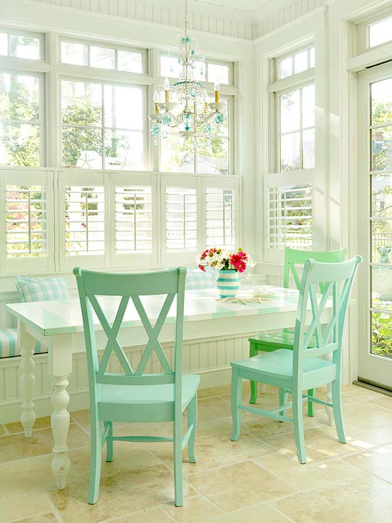
What a happy kitchen…. so light and airy and fresh. The tile freshens and grounds the space, yet gives depth and dimension.
What a great spot to start the day! I think I could turn this breakfast table into my office.
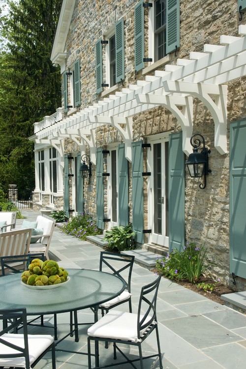
I’m totally smitten with the stone and the textural interest with the faux pergola and the gorgeous shutters.
So… in lieu of my favorite butter yellow… I’m calm and relaxed and my spirit feels freer after “living” for a while midst the shades of turquoise. I’m not sure if I would create a whole house around this color family. But, it sure was nice for today.
Does it work for you?
And, who knew that yellow vibrated and would impact my psyche the way it did?
Oh… before you go… be sure to share your favorite color.
More Home Decor Ideas…
 Make a Small Space Live Big with these Easy Decorating Tips
 Home Tour Part 2 :: She’s got Birds and Trees on Her Walls!
 5 Quick and Easy Steps to Making a Spring Vignette

Receive FREE inspiration like this in your inbox!
Sign up Now.
P.S. I know that I mixed styles in this post. But, don’t worry… my home is more cohesive… today’s mix was just for fun! And I do hope it was as fun for you as it was for me.


Very eye opening about the yellow…who knew? I love blues and turquoise I adore. It does calm me and makes me smile. Thanks for the relaxing tour!
I love the turquoise and aquas! I am thinking about painting my dining room a pale aqua. It is a golden yellow right now and I think I need a change. My little sunroom is an aqua color and I love it.
So. Color psychology…. Hmm.what color is the couch?
Who knew? I’ve never been a fan of yellow. I go for warmer tones blue, beige, tan, barnhouse red, green. This was interesting!!
My favorites have varied from orange to red, “earth tones”, yellow then suddenly I’ve been drawn to turquoise and teal. My dining room is the Martha Stewart Artesian Well in your color swatch. People come for lunch at 11 and they are still here at 4 pm, because the room is so serene. The powder room is a bit darker – Sunken Pool — and the living room, office and one bedroom are another Martha Stewart- a lighter shade called Morning Fog. It’s the first time I’ve done a whole house plan and I just love how it all flows together. But you know what — the center of the house, all the hallways, are a beautiful butter yellow! Maybe some of the effect is in the “company one keeps”. The serene and peaceful turquoise enhances the positives of the pale yellow. I do become uncomfortable when there is bright yellow around and never realized why!
Please don’t tell me that! It took me 8 years to finally pick and purchase the perfect creamy buttery, French vanilla yellow for my house! 😉
Glo… I think you’ll be just fine. I’m over my color stress, now. Usually these things are fairly short lived. But, if you notice at some point that your get a little tense in that room… find a way to destress so you can keep enjoying your beautiful French vanilla yellow. It sounds delicious!! Maybe you need to share your paint color/number with me. 😉
The psychology of colors is very important in our lives during the day, they express feelings, convey emotions, arouse desires, wishes and influence on our behavior. Great text!
Maybe something nasty happened to you when you were wearing yellow or were in a yellow room. Nice that you only have yellow to get stressed over. I’m watching my neighbour move out next door as I write after domestic abuse. Feel very sorry for her. Don’t get stressed about yellow, enjoy life, even yellow.
Living on the water in beautiful brigantine our home was every shade of blue and blue greens. Very pale and white we found this very calming. However my kitchen was white and I took the brighter colors as accents for the holidays Here I used yellows oranges etc for autumn and red or silver blue for Christmas pale yellows pinks blues etc for the Easter holidays By keeping it mostly white I could add either a bright or pale pallet I had a bedroom in white with curtains and bedding in dots of all bright colors in sheer curtains When we recently sold the new owners asked to keep this palette as their young daughter loved it In closing I believe we can add color to different rooms to use the brights if we are so geared to a calmer palette as I am So don’t be afraid to experiment paint is N easy fix!
Blue is my favorite color. I do love a bright yellow in my kitchen, with white trim and cabinents. Weird maybe, but the yellow helps me start my day out happily!
Thanks for taking the time to pop by with your color thoughts, Pat! One of my besties has bright yellow in her kitchen with white cabinets and trim, too. It looks fabulous and you’re right… it’s a very happy place.
All the best for more blue and yellow happiness. Cheers!!
I love yellow. I actually painted my bedroom in my first house many years ago yellow. It was a small house, with a 13 x 13 ft space with a dormer. I read that yellow makes a room look bigger. That is all I had to read. It worked! Back then there were not 59 different shades of one color. you just a 5. Made the job of picking a color easier! Now my current bedroom is green. Very restful, and I am getting ready to paint a 2nd bedroom a turquoise color. There are too many shades to pick from! But it looks to be a popular color right now.
Hey Trish!
I think yellow is making a resurgence right now in a very bright caution yellow. Have fun choosing that perfect shade of turquoise – you can’t go wrong for sure!!
Happy New Year!
Love it!,
Blue
I’m inspired.
Thank you
I love the blues. My kitchen, dinning room and 1 wall in my living room are a pastel blue. I have a small condo so it is open. The other walls in the living room are white.
My husband and I painted most of the common rooms of our former house golden yellow with a maroon fabric in the great room. And now for our new house, another golden yellow wallpaper as an accent to a deep purple wall in the common living area.
To me, yellow makes me feel alive! It’s bright and sunny. Blues actually bothers me. I don’t know why. I painted our corridor turquoise but I’m thinking to change it with maybe cream or off white.
Thanks for the article. Im curious why I dislike blue on walls when others think it’s calming. Though, I love wearing hues of blue especially love them in nature but not on our wall.
But, I still like to paint the exterior of the house dainty blue and off white because it will look great against the grey pavers.😊
Your home sounds so happy and joyful, Dirah! Enjoy your cheerful colors in your home and your calmer colors in your dress. What a lovely contrast that’s all YOU!
Have a colorful and extraordinary day!
What is the paint color info for the double front entrance doors, leading into that gorgeous foyer? Thank you!
I was thinking just like you. I have the paint swatches in my dining room —yellow &/ turquoise, and turquoise for the kitchen. This was super helpful! Still trying to decide. Thank you for the insight!
Thanks for the tour! I’d love to know the color green of the French doors in the first shot if you have any info. And my favorite color is green!